Case Studies
Case Studies without filter
- client name
Samuel
Bowman
Project name
Bowman & Co L.L.C.
Bowman & Co L.L.C. is a law firm that has been providing legal services since 1982.
They have established a relationship of trust with their customers who are never disappointed of the work provided, because this firm met a point of honor to satisfy them.
Objectives:
- Have a smooth navigation on the mobile that is user-friendly for users
- The architecture should be the image of the firm and make the content of the site more accessible to Internet users.
- To be able to update our news by copy paste
- Optimum SEO to have more prospects online
- Adaptation of a responsive and easy-to-manage content management system such as WordPress
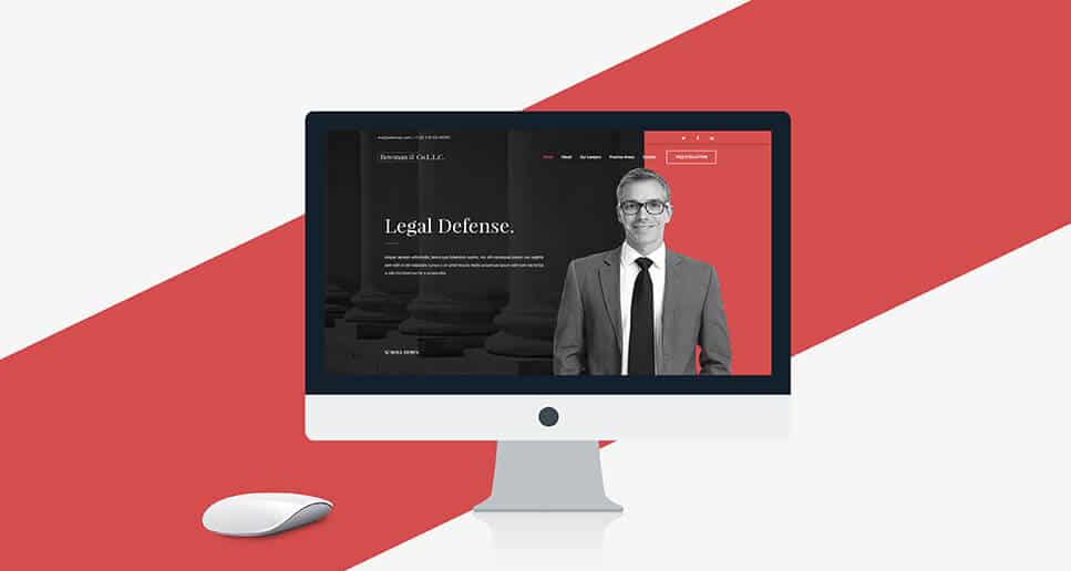
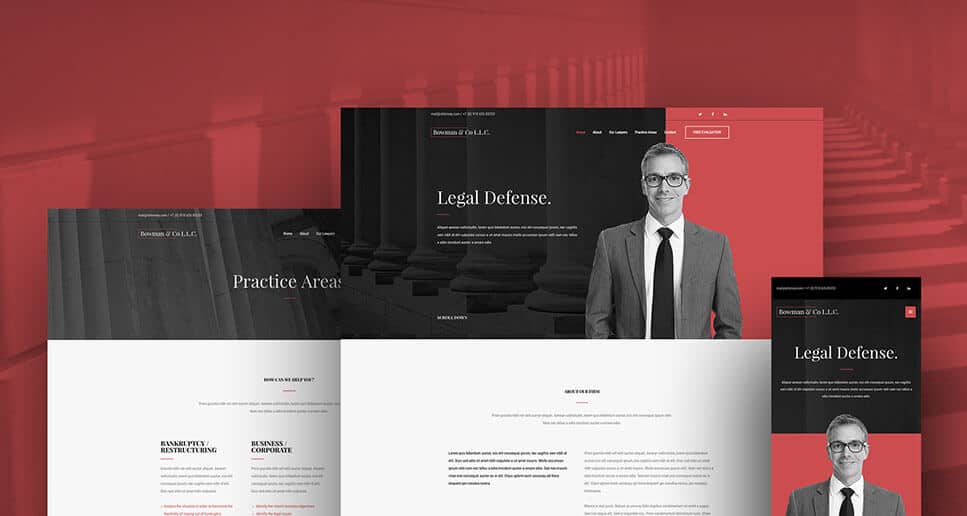
Prototyping: Bowman & Co L.L.C wanted a design that is in the continuity of their firm and which respects their color code.
The design should be refined and reassuring because the goal is to put their customer in trust and have a navigation that is intuitive for users.
WordPress CMS is ideal for easy management of their content as well as SEO. The blog is the most appropriate solution for their news, because it also contributes to the development of SEO.
Design: Red and black represent the color code of Bowman & Co L.L.C, we have highlighted its colors which represent strength and victory in the header of the website. For the rest of the page, we chose white to rebalance and facilitate the reading of users.
- client name
Jennifer
Lee
Project name
web_Studio
Proin gravida nibh vel velit auctor aliquet. Aenean sollicitudin, lorem quis bibendum auctor, nisi elit consequat ipsum, nec sagittis sem nibh id elit. Duis sed odio sit amet nibh vulputate cursus a sit amet mauris. Morbi accumsan ipsum velit. Nam nec tellus a odio tincidunt auctor a ornare odio. Sed non mauris vitae erat consequat auctor eu in elit.
Class aptent taciti sociosqu ad litora torquent per conubia nostra, per inceptos himenaeos. Mauris in erat justo. Nullam ac urna eu felis dapibus condimentum sit amet a augue. Sed non neque elit.
- client name
Stephanie
Ross
Project name
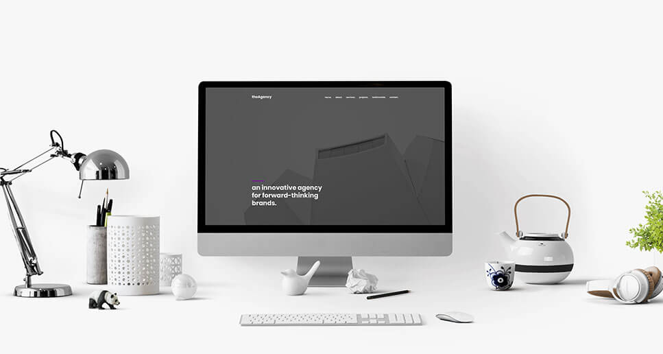
theAgency
The Agency is a brand agency that has existed since 1990.
Their goal is to shape brands and build an image from A to Z.
Objectives:
- An attractive site that makes future customers want to engage.
- Navigation must be as clear as it is clear
- Social Network Development
- SEO optimized for new prospects
- Implementing WordPress CMS for easy content management
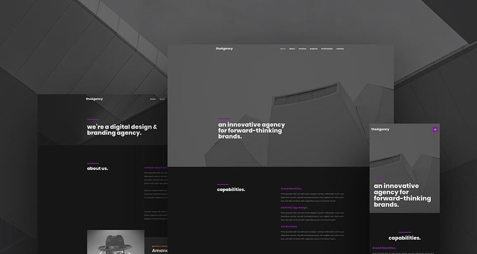
Prototyping: The design was the most important for The Agency because being a branded agency he had to have
a website with an impeccable design. the Agency did not have a defined color code.
We must offer them a design site that would engage the customer at the same time.
The navigation had to be simple and fluid for the users. The synchronization of their news to the various social networks has been installed which will greatly contribute to the SEO of the site and generate new prospects.
Design: We have chosen the black color which is the universal color per excellence and which leaves no room for any interpretation, moreover black is reputed to be a very chic color often used in the world of luxury. We rebalanced it with gray and brought some accents of purple to pop out the whole design.